Monday, May 12, 2008
Studio Interactive: Afterworld Game Design
Afterworld Files
Thursday, February 7, 2008
Information Architecture - International Flight System
Thursday, November 29, 2007
Studio Interface: Schproket Multitouch
Game Design: Get Out of the Room!
Get Out of the Room! group members
Clayton Richardson
Sam Strick
Subalekha Udayasankar
--------------------------------------
Rules to be uploaded.
Saturday, November 24, 2007
Studio Interface: Urban Mannequin
Donny Chou Wu
--------------------------------
Instruction Set for Strangers
The Urban Mannequin project was created with the ambitious task of asking strangers in a public setting to interact with each other. Donny and I decided to create a community story.
We choose to set our project up at the Bedford L train stop in Williamsburg, Brooklyn. This area has a wide variety of inhabitants but is largely young, artistic youth. We felt this would be a great area to find people who would be willing to participate.
The Setup:
What to write on? There were many choices available to create a canvas, our initial thought was a mannequin. Mannequins are an anomaly in the modern world, they are human in form which draws immediate feelings/thoughts to mind. This we thought was important for drawing attention to the project and for creating thoughtful responses to our prompt. Not many things in the world can draw attention like a naked woman, even if she is made of plaster.

Prototype: The Baby
Before we set the project up we had several questions that needed answering. The main being, how much graffiti should we expect in the public setting? The other questions were; what should the prompt be?, how should we physically set up the piece?, and how much time does the piece need to be in the setting?
We tested some of these ideas with a baby doll set in the Parsons 10th floor lobby.
The baby doll was tied to a coffee table in the lobby for 24 hours, with 1 marker attached to it. This is the result.

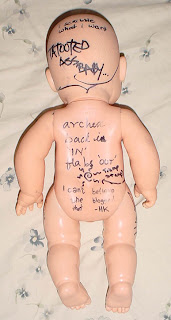
We concluded that a naked doll definitely grabs attention and inspires response from creative individuals. The graffiti caused some concern for us and the prompt of 'Dear baby,' on the forehead did not generate any direct response.
The question then became, what kind of prompt will illicit thoughtful responses instead of just graffiti? We knew that there was no way to stop graffiti but minimizing it was our goal for creating the prompt.
Some of our thoughts for a prompt were:
Cloth me with memories
My soul yearns for
The bedford story
I knew a girl who...
We decided on using, 'My Soul Yearns For,' as the prompt and it did create direct responses. We set the mannequin on the street for 6 1/2 hours (with one of us watching it from a nearby restaurant). The time limit of our availability and my concern of leaving it unwatched most definitely left more to be desired from the outcome, although we are happy with the outcome of the Urban Mannequin.
Here are some images of the mannequin once returned from the street.


Game Design: Deathball Extreme Elimination
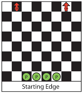 Pieces:
4 Player Figures
2 Deathball Figures
2 six sided dice
Chessboard
Bounce Template
2 Border Rings
Setup:
Each player chooses a figure to play with and then rolls one 6 sided die to see who goes first. The highest roll wins, a tie for highest is rolled again to determine the true winner. This winner is Player One and places their figure on the starting board edge. In clockwise order the other players place their figures on the starting board edge. The players must set up in the four center spaces on the starting board edge.
The two Deathballs are placed one space in from each corner of the edge opposite the starting board edge, facing away from the Player’s figures.
Movement:
Players move in order, Player One moves first and then each player in clockwise order moves. After all Players have moved both Deathballs move, the Players are responsible for physically moving the Deathball pieces, this can be done by anyone.
- No Players may occupy the same space.
- The Deathballs may occupy the same space.
- If a Deathball and a Player are in the same space for any reason at any time, the Player is killed and removed from the board.
- Player Movement:
- All Players must move 2 spaces each turn.
- They may not move diagonally.
- They may not end a move in the same space they started the move.
- Deathball Movement:
- Both Deathballs move after all Players have moved.
- Deathballs must move 6 spaces each turn.
- Deathballs always move in a straight line, which may be diagonal, until they hit a board edge.
- When a Deathball hits a board edge roll 1d6 to determine which way the ball bounces. Align the Bounce template with the red arrow touching the wall or if in a corner touching the corner. (see below) Turn the Deathball to its new direction and finish any movement it may have left.

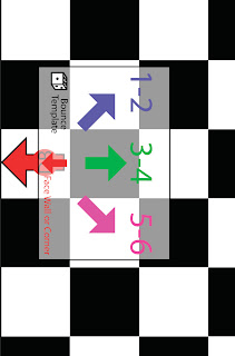
Bouncing off a wall
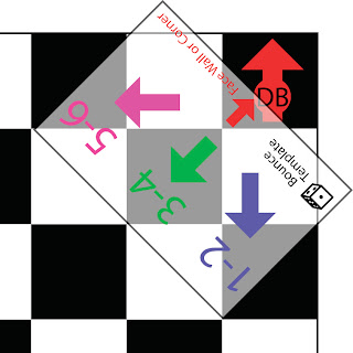
Bouncing off a corner
Notes:
- The Deathballs first move will always start by bouncing off the wall.
- Facing does matter for the Deathballs but not the Players. This is to help remember the direction each Deathball is moving in.
- The Deathballs are considered to be moving at the same time.
Players may push each other by moving into a space already occupied. The pushing Player moves into the space and pushes the other Player in a straight line into the next space. A player may not be pushed off the board but may be pushed into another player who then is also pushed or into the ball and is then killed.
Dying:
After finishing the movement for the Deathballs remove any killed Players.
The board shrinks when a Player is removed. After the first player has died place the Red Border Ring on the board, then after the second player has died place the Green Border Ring on the board.
Ex. So when the first Player dies, place the red border ring on the board which shrinks the playing area to 6x6 spaces.
If any Player or Deathball is on the removed spaces, push the piece to the nearest space within the new board size. Remember that another Player may die during this pushing, so the board will shrink again.
Winner:
One Player has won as soon as all three other players have been killed. If the last two players are eliminated at the same time then there is no winner. (This will only happen if each player is hit by a different deathball.)
Game Design: Rules for game I played as a kid
Pick a player to start. That player creates a dangerous situation that all the other players will have to escape or evade using the three items they have already picked. In turn the other players tell a story of how they will escape. Any player may interrupt the story and question the validity of what just happened, these are comments only and are meant to discredit the storyteller’s tale.
After all the players have told their stories the situation creator decides on a winner, based mainly on the story but also considers the discredits mentioned. The best story wins.
Over time there were a couple amendments to the known rules. First, ‘combo-items’ were not allowed. So my friend Keith could not take his fishing pole and high strength fishing line as one item. The second amendment wasn’t really an amendment it was a general consensus among the regular players that our friend Pete would never win because it was fun to see Pete whine about how his story was great and should have won. Pete was unaware of our actually discussing this but he knew that he never won.
Studio Interface: Mirror Project
Rohini Metharam
Melissa Marcus
------------------------------
The goal of this project was to create combine the user qualities of several products into a new object. My group's products were a toothbrush, high heel shoes, and an alarm clock.
While these products seemingly have nothing in common, we found several qualities that could be combined into something new. The qualities we focused on were:
Alarm Clock Qualities:
Time keeping, Scheduling, Waking up, Radio, Compact/small, Time Management, Everyday use, many styles/varieties, Can be modern design
High Heels Qualities:
Fashionable, Contemporary, Haute couture, Accessory, Health Concerns/problems, Everyday use ? Event Use ?, Compact/small, many styles/varieties, Name Brand recognition, Confident, Sexy, Can be Modern Design
Toothbrush Qualities:
Hygiene, Compact/small, Everyday use, many styles/varieties, Health improvement, Clean, Confident, Modern Design, Name brand recognition
Existing Similarities:
Compact/small, Everyday use, Modern Design
With such a wide scope, we brainstormed what type of product could fit the bill. In the end of the session the group decided to make a new product. The idea was a touchscreen interface used for time management/scheduling and everyday self maintenance was interesting. This evolved from a conversation about the toothbrush, then morning activities, then how can you save time in the morning, then what could we make to help with time management in the context of regular morning activities.
From this conversation we all came up ideas for this interface. Here is my mockup of what it could be, a combination of iGoogle and a touchscreen mirror.

User Scenario 1:
- Wake up
- Go to restroom, interface turns on when he switches on the light in the bathroom
- He will choose his user profile
- Customized mirror interface turns on
- Features include e-mail, sports, & music
- While brushing teeth he gets an alert that he has received new e-mail messages
- we purposely did not include a keyboard because it distracts the user and it would be time consuming to respond to messages, etc.
- When done brush teeth he turns on the water to take a shower, while waiting for the water to heat up he chooses the top 20 countdown so he can listen to music while showering
- After showering, he is now ready and brushing his hair and chooses the option to look at sport scores
- Now he wants to be able to just see himself in the mirror so he taps the screen and all of the functions go away, and logs off the interface
- Next, he goes to get dressed, grabs coffee & breakfast, and heads out the door
- The mirror interface has allowed him to get ready in half the time.
Sally’s really busy with her professional career and her a pursuit of an acting career. Her schedule is always full and changes frequently. Often she must prepare for several activities and meetings that occur after a full day of work.
- Calendar feature sinks with existing digital calendars on PC or PDA.
- Can prioritize with color coding, giving a easy to read glimpse of the day.
- Clicking on a meeting will show details
- Time and Date
- Location
- Who its with
- Possibly Directions (from an earlier meeting’s location)
- If she needs to move an appointment, she can drag it to a new timeslot.
- This then updates her other calendars.
- She can set alerts to remind herself of important events.
Here is the mockup of our design:
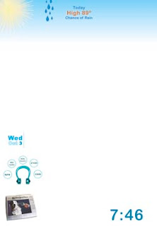
Widgets Closed
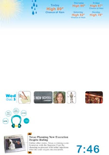
Widgets Open
And a video mockup of the finished design:
